- Furniture
- 0 likes
- 1835 views
- 0 comments
Whether it be spots, stripes or snake print, interior designers have always explored combinations of prints and patterns to create unique designs and colour fusions! Attempting that balance between patterns and print unassisted can often lead to some unfortunate clashes. Is there a technique to minimise the eyesores and balance these extremes within your home in 2023?
We unpack the methods of how to introduce the union between prints and patterns to make the best use of your space!
Don’t Rush
When you are starting off selecting your prints and patterns, consider the tone you would like to set in your room. What are you hoping this contributes to your space?
Head down to your local DIY shop and make the most of the samples! Lay them all out and have a play around with the combinations. Remember, designing your dream home should be fun. Learn which styles work for you.

Use Textiles to Introduce Patterns and Prints
If you aren’t as confident with patterns and prints, start small with a cushion or a blanket. For example, to brighten up a neutral-tone armchair, add some bold floral pillows. Decorate the space slowly, and once you're happy, you can explore the more striking prints and patterns with your furniture, art or wallpaper.
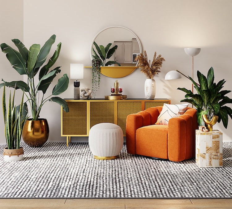
For those braving the bold for the first time, why not try harmonising your space from the floor up with rugs or a carpet? It can make it easier for you further down the line by already covering a pivotal part of the space. It can also set the atmosphere of the room and help you maintain a visual balance throughout your creative journey.
Focal Points Within The Space
Everyone always has a favourite feature, so make sure to accentuate it! Identify your favourite areas within the space and use this to help inspire your decisions. Whether it's the fireplace, windowsill, or doorway, using patterns and prints can be a great way to draw the focus and highlight your home's fabulous features.
Show off the best parts of the space! Experimenting with the scale of accessories and furniture can also be used to draw further attention to other areas of the space.

Colour Is King
Add some more flair! Even though the zebra print and floral pattern combination might be the highlight of your space, the colour scheme of the remaining interior can play a large factor in the overall atmosphere of the room.
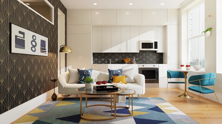
Try identifying key colours in the print in the initial design stage and slowly feeding them into the space. This can help to avoid the space feeling disjointed or divided. You can do this by introducing accessories and furnishings with that colour scheme, therefore creating a more visually balanced space.
Despite the patterns and prints being the clear features within the space, the surrounding colours mustn't be forgotten. They play a key role in helping to accentuate underplayed mutual colours in the patterns and unify the space together.
Be Brave
Finally, decorate and design with confidence. Your home is your castle but also your canvas; there are no rules. If you can’t express yourself there, then where can you? Especially when mixing prints and patterns, own your decisions. If you aren’t sure, leave it and come back to it in a few hours; see how it looks in a different light or later in the day.
Will you be experimenting with prints and patterns in your home? Check out our full range of furniture and accessories to make those colours pop throughout your space and truly tailor your home to you!


.png)
Comments (0)